Icons/Logos

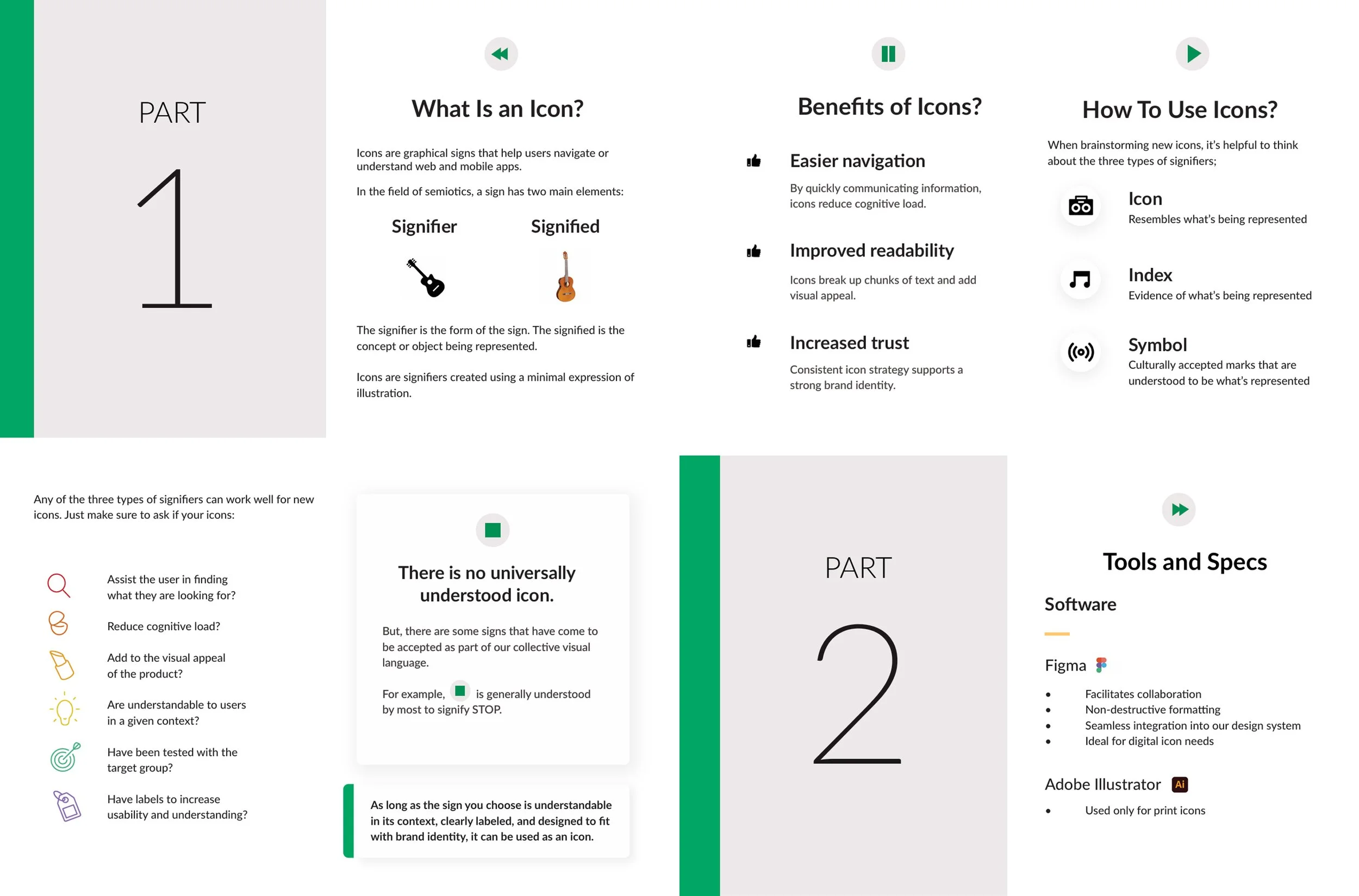
Bank of the West Icon Strategy
Leading an icon strategy of this scale was quite challenging. Conducting extensive research, designing and testing numerous icons across different sizes, styles, and contexts was a lengthy and intricate process. Sharing the knowledge of icon usage and creation with fellow designers was immensely gratifying, marking one of the most fulfilling professional experiences I've had.


My Perfect Helpers
When Alexandra approached me to help her create a logo for her new nanny business, I was immediately interested. We worked closely together to create a logo that felt just as genuine and caring as the Nannies that she connected to her Clients. We continue working together to build her strong yet gentle brand.


Camelbak Logo Re-design
Roxanne was in need of of a spice up to an old, dusty logo. The Camelbak brand had been re-imagined years ago but there was an outlier that continued to stay on the roster. A 90’s looking Punisher skull with tribal flames to match. She and I agreed, it needed a face lift.

Roxanne spent over a decade with the military division of Camelbak. Her unique perspective inspired artwork that spoke to the strength of the armed forces while also allowing a little bit of fun in.


Shine Boss Automotive Conditioning
David needed a logo and asked for my help. He was adamant about not using the stereotypical sports car silhouette that you see on almost every other auto detailing service center. He wanted his tried and true buffer tool to be the symbol of his daily hard work. He also wanted to stay away from the obvious water blue. This was like a visual taboo.

There are often several iterations in my process but in this one had some fun ones. I had a great time with this project and I think it shows in the unfortunately scrapped versions.

